Go on then - why? We want clean simple classy kits - why is that high expectation? We did it in first year of AdidasThe expectations of some of you lot in here are incredible
You are using an out of date browser. It may not display this or other websites correctly.
You should upgrade or use an alternative browser.
You should upgrade or use an alternative browser.
Castore
- Thread starter MobNet Wolf
- Start date
Derbywolf85
Just doesn't shut up
- Joined
- Mar 29, 2010
- Messages
- 2,118
- Reaction score
- 4,439
Because you just expect that the kit will land EXACTLY how you want it to land and you shut off shop to anything that deviates from your idea of "perfect".Go on then - why? We want clean simple classy kits - why is that high expectation? We did it in first year of Adidas
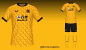
Those 2 kits are "simple" kits. You could argue the black panels are an embellishment, but how much of one? They're not tyre tracks or arrows or big splodges of blue. They're plain kits with a bit of panelling on (both clearly tribute kits as well - The home on to the 08-09 Promotion kit and the away one to the Manders kits from the late 80's).
I just think folks go "THAT ISN'T *PRECISELY* WHAT I WANTED SO IT'S ****".
Bill S Preston Esq.
Just doesn't shut up
- Joined
- Feb 27, 2016
- Messages
- 11,302
- Reaction score
- 18,238
I've already stated if the black detailing on the shirt ties in to the shorts design it'll probably look fine.In fairness, I think that all people "expect" (or perhaps "would like" is closer to the truth) is pretty much what is in those photos... but without the odd little embellishments. That crisp, white away shirt is the finished article ... then some designer adds weird yellowy triangles just below the shoulder; the home kit looks pretty good to me ... and, again, somebody decides that they want little black boxes on the sides and three peculiar, black dots (unless they're part of the photo watermark overlay!). It's adding fiddly bits and bobs for the sake of it onto what are, essentially, strong and clean designs. Perhaps in real life, these extra elements won't 'pop' quite as much and blend into the background (same with the colour - best to judge that in real life) but when shirt pics suddenly appear, people let their eyes crawl all over them searching out everything they hate... June/July is annual new-shirt-hating season in football!
Personally, I've not bought a shirt since the 90's so I suppose it's not much bother to me but, for what it's worth, the above are my thoughts... if these prove to be the actual shirts then they're 95% of the way there but I think a lot of folks like clean shirt designs, free of unnecessary flim-flam.
Tring Wolf
MolMix Poster of the Season Winner 2011-2012 and r
- Joined
- Oct 1, 2011
- Messages
- 26,814
- Reaction score
- 38,415
You just can’t have a good Wolves kit with that sponsors logo. Not because it’s a betting company (although that’s not ideal) but because it is quite possibly the ugliest, worst-designed logo I have ever set eyes on. Same with The Money Shop. The contrast in aesthetics between those and the W88 logo is huge.
On a side note, the Adidas templates we discarded for this year were actually pretty nice.

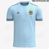
On a side note, the Adidas templates we discarded for this year were actually pretty nice.


Wall heath Wanderer
Just doesn't shut up
- Joined
- Jan 1, 2013
- Messages
- 6,707
- Reaction score
- 6,493
That home one would have been class, especially without any sponsors at all. Add a real collar to it and then keep it for eternity.You just can’t have a good Wolves kit with that sponsors logo. Not because it’s a betting company (although that’s not ideal) but because it is quite possibly the ugliest, worst-designed logo I have ever set eyes on. Same with The Money Shop. The contrast in aesthetics between those and the W88 logo is huge.
On a side note, the Adidas templates we discarded for this year were actually pretty nice.
View attachment 21746View attachment 21747
Never been fond of the blue away kits though, much prefer the old white one.
Kebab Warrior
Just doesn't shut up
- Joined
- Aug 26, 2019
- Messages
- 4,709
- Reaction score
- 12,250
Portuwolves kit and black away in 019 were great in my opinion. Mexico 3rd was decent too!i continue to be gobsmacked by the ineptitude of wolverhampton wanderers' kit designers
they briefly got their **** together in 2018 but apart from that, have been complete and utter carp for my entire adult life.
I think these are just extremely 'meh'.
The away one is OK, but that's just because it's a plain white one (pretty much) that looks as much like the Admiral/Doritos one from 2002 (The collar and cuffs are bang on) as it does the Manders one, and a few others others, nothing to get excited about.
The home shirt is about as boring as it gets, the only thing 'jazzing it up' is the one thing everyone agrees looks bad (the black on the sides).
Just feels like they've played it weirdly safe, but without going down the 'clean and classy' approach that Adidas did their first year.
Of course I agree that no shirts will look nice with that logo though.
Except last seasons blue/white shirt, now that was exciting!
OoohRobbieRobbie
Just doesn't shut up
- Joined
- Jul 26, 2010
- Messages
- 4,020
- Reaction score
- 1,582
I get what you're saying to an extent, it's tough to please 'everyone'.The expectations of some of you lot in here are incredible
The problem is mate, it is not difficult to make a nice kit. It really isn't. Ours have been ****ing TURD since 2nd Prem season.
Sussex Wolf
Just doesn't shut up
- Joined
- Jan 31, 2012
- Messages
- 24,362
- Reaction score
- 34,260
Some of the 2nd / 3rd strips have been nice to be fair. The Mexican and Portuguese inspired ones to be precise.I get what you're saying to an extent, it's tough to please 'everyone'.
The problem is mate, it is not difficult to make a nice kit. It really isn't. Ours have been ****ing TURD since 2nd Prem season.
Derbywolf85
Just doesn't shut up
- Joined
- Mar 29, 2010
- Messages
- 2,118
- Reaction score
- 4,439
I get what you're saying to an extent, it's tough to please 'everyone'.
The problem is mate, it is not difficult to make a nice kit. It really isn't. Ours have been ****ing TURD since 2nd Prem season.
They have, I agree - but I'm not getting my boxers in a knot over it or screaming that I'll be keeping my money.
OoohRobbieRobbie
Just doesn't shut up
- Joined
- Jul 26, 2010
- Messages
- 4,020
- Reaction score
- 1,582
I'd prefer to buy a shirt for the first time since first Prem season. It is frustrating, personally.They have, I agree - but I'm not getting my boxers in a knot over it or screaming that I'll be keeping my money.
I too will be keeping my money, it's just embarrassing how ****e they are when it's not difficult.
The kit supplier (Castore) works with a small number of people at the club and they select from a load of templates. So this is either the best of a ****ing woeful bunch, or we have the same 14 year old making decisions who thought last seasons 3rd kit was good, or to have different shades of "gold" on the badge to the shirt or the socks.
OoohRobbieRobbie
Just doesn't shut up
- Joined
- Jul 26, 2010
- Messages
- 4,020
- Reaction score
- 1,582
Yeh I quite liked the Portugal one, it meant you could barely see the classy metallic McDonald's sponsor so that was something.Some of the 2nd / 3rd strips have been nice to be fair. The Mexican and Portuguese inspired ones to be precise.
We wear those what, 3 times max?
The home kits have been just pathetic since season 2.
Kingswood Wolf
Has a lot to say
- Joined
- Nov 12, 2010
- Messages
- 1,891
- Reaction score
- 2,366
Surely there's someone on here with a few million quid spare who can do the decent thing and give it to Jeff with the proviso that he bins off ManBetX?
Come on, it'd be a gesture.
Come on, it'd be a gesture.
Kelevra
Well-Known Member
- Joined
- Apr 4, 2021
- Messages
- 51
- Reaction score
- 81
Beautiful shirts. Sponsor ruins them, as we know
TrueWolf
Senior Member
- Joined
- Jul 10, 2019
- Messages
- 404
- Reaction score
- 1,662
Leaked away kit.
Edit: created a separate thread for this after discovering it was more than just the away kit leaked.
More info there.
Edit: created a separate thread for this after discovering it was more than just the away kit leaked.
More info there.
Last edited:
GY Wolf
Just doesn't shut up
- Joined
- May 4, 2009
- Messages
- 5,701
- Reaction score
- 3,518
Why that daft gold bit on the shoulder? Haha, would be absolutely perfect without that, forgetting the ugly sponsor..
Jefe
Just doesn't shut up
- Joined
- Jun 2, 2021
- Messages
- 5,116
- Reaction score
- 9,633
It's difficult to have aesthetically pleasing kits when they're just so busy with ugly looking sponsors. That ManBetX have survived into a third season is ridiculous- it's easily the most hideous shirt sponsor I've seen on a Wolves top. Plus, it's a gambling company so there's the ethical baggage that comes with that. The red Bitci shirt logo adds to the sense that too many disparate elements are clashing together.
Besides that, I like the classic vibe of the neck and arm trim on the away top, and the general colour / texture, though not such a fan of the gold triangle on the shoulder.
The home kit is a bit odd, really. You have basically a decent classic shirt, then they decided to put weird black love handles on it. It might look alright if all the players do a Ryan Bennett and tuck into their shorts. And what is that, studs? Lace holes? All rather BDSM-evocative.
The third kit looks like the pavement outside a kebab house in the small hours of Sunday morning. Rank.
Jay Jay de Wolf
Just doesn't shut up
- Joined
- Apr 28, 2018
- Messages
- 3,898
- Reaction score
- 3,952
wolvesaywe
Just doesn't shut up
- Joined
- Aug 13, 2016
- Messages
- 5,625
- Reaction score
- 18,273
As per Mix forum law at this time of year we've moved seamlessly from bursting blood vessels over impending price rises to getting haughty over leaked images of next season's kit
To be followed in a month or two following the official release by a change of general opinion that it actually looks pretty good on the players
To be followed in a month or two following the official release by a change of general opinion that it actually looks pretty good on the players
Achilles Last Stand
Senior Member
- Joined
- Oct 17, 2018
- Messages
- 700
- Reaction score
- 1,077
Maybe we should just wait until it is officially presented by the club?
Now we have only seen a part of it, so it is a lot of guesswork on how it really looks.
Now we have only seen a part of it, so it is a lot of guesswork on how it really looks.
iamthenewno2
Senior Member
- Joined
- Apr 21, 2018
- Messages
- 421
- Reaction score
- 572
Pineapple comes to mind
concept, not leaked
I think they look pretty good. The problem that Castore (and any other manufacturer) have is that with the commercial pressure meaning they need to produce a new kit every 12 months, they have to have the jazzy bits and pieces to make them different from last years/next years, and every year after that ad infinitum. I'm sure that Wolves and Castore are aware that most fans would want a plain top with minimal faff, the problem is if they actually produce the 'perfect' shirt this year where do they go from there in 12 months?
Anyway, I'll get back in my box
Anyway, I'll get back in my box
Last edited:
D
Deleted member 4456
Guest
That reminds me of a bowl of Shreddies.
Wonder Boyo
Yma O Hyd
- Joined
- Aug 10, 2005
- Messages
- 11,271
- Reaction score
- 25,911
When have we normally released our new kit under Fosun? (Obviously not including last year, because the season finished so late). I get the impression it's always a bit later than most clubs. Maybe mid June?
freezin
Just doesn't shut up
- Joined
- Aug 5, 2006
- Messages
- 9,301
- Reaction score
- 4,475
I don't mind the away kit
Alex Rae The Substitute
Just doesn't shut up
- Joined
- May 14, 2012
- Messages
- 7,491
- Reaction score
- 9,202
ah well, another year with my wallet staying tightly shut.
briefly got excited about the away one until someone pointed out the bizarre triangles on the shoulder (note they're a different colour to the 'gold' in the collar)
home strip: why does every black bit need white piping FFS
and as for the sponsor..... just dreadful.
i suppose i should be grateful they're relatively plain and harmless, but what does it take to design something tasteful and in harness with our heritage.
Completely agree, that little triangle on the shoulder completely ruins what would otherwise be a really nice and simple away kit.
Alex Rae The Substitute
Just doesn't shut up
- Joined
- May 14, 2012
- Messages
- 7,491
- Reaction score
- 9,202
The new Rangers tracksuit looks decent enough, a little bland but if we had that in black with our crest would be half decent. Seems to be £95 though and maybe just the jacket!
View attachment 21744
You can guarantee our design team will say “No, too simple, too classy. We need shapes, triangles and circles ideally, and yes add in a third colour to offset the simplicity”.
Alex Rae The Substitute
Just doesn't shut up
- Joined
- May 14, 2012
- Messages
- 7,491
- Reaction score
- 9,202
Rangers current 3rd GK kit. I'd have a template if we could have this in our gold.
View attachment 21745
Yep in our gold colour... simple!
I don’t know why we insist on having such bad/ complex kit designs at Wolves. 2018/19 being the overwhelming exception to the rule.
Their are some clubs that seem to consistently get their kits spot on: Arsenal, Everton, West Ham for example... I know it’s all subjective, but they always seem to come out with fairly quality designs.
Ian
Just doesn't shut up
- Joined
- Nov 25, 2007
- Messages
- 2,130
- Reaction score
- 2,881
They remind me of our Spall kits from the Division 4 days. Nice, lower league kits.
Yep thats what I thought...... dated, conference league, cheap and nasty looking.
Padraig
Just doesn't shut up
- Joined
- Oct 20, 2011
- Messages
- 4,022
- Reaction score
- 4,402
The away kit is very nice and will be popular.
The home kit is quite dreadful. Looks like a Le Coq Sportif effort from 15 years ago. What on earth are the holes down the side?
The home kit is quite dreadful. Looks like a Le Coq Sportif effort from 15 years ago. What on earth are the holes down the side?
SteveBullsKnee
Just doesn't shut up
- Joined
- Feb 17, 2015
- Messages
- 13,505
- Reaction score
- 29,388
In all fairness this place was up in absolute arms about the colour of the first Adidas kit.Go on then - why? We want clean simple classy kits - why is that high expectation? We did it in first year of Adidas
(A standard problem really, no one can ever agree on the correct shade of old gold)
Corporal Hicks
Groupie
- Joined
- Jan 2, 2018
- Messages
- 230
- Reaction score
- 393
Unimpressed if correct made even worse by the ridiculously dreadful sponsor logo.
Is it really that difficult year on year to come up with a clean, simple design? Who pulls these things together, the project teams from The Apprentice?
Is it really that difficult year on year to come up with a clean, simple design? Who pulls these things together, the project teams from The Apprentice?
wolvesaywe
Just doesn't shut up
- Joined
- Aug 13, 2016
- Messages
- 5,625
- Reaction score
- 18,273
They don't design the kit with middle aged men in mind
Bill S Preston Esq.
Just doesn't shut up
- Joined
- Feb 27, 2016
- Messages
- 11,302
- Reaction score
- 18,238
Red tracksuits just because.You can guarantee our design team will say “No, too simple, too classy. We need shapes, triangles and circles ideally, and yes add in a third colour to offset the simplicity”.
moseleyite
Just doesn't shut up
- Joined
- Aug 13, 2012
- Messages
- 5,118
- Reaction score
- 4,361
No, don't, it's a very fair point - these are not just something that signifies an identity (for want of a better term) but a commercial undertaking. It's probably quite a thankless task to produce something that both satisfies the purists and is distinct enough from last years model that people will buy it!I think they look pretty good. The problem that Castore (and any other manufacturer) have is that with the commercial pressure meaning they need to produce a new kit every 12 months, they have to have the jazzy bits and pieces to make them different from last years/next years, and every year after that ad infinitum. I'm sure that Wolves and Castore are aware that most fans would want a plain top with minimal faff, the problem is if they actually produce the 'perfect' shirt this year where do they go from there in 12 months?
Anyway, I'll get back in my box
Portuwolves kit and black away in 019 were great in my opinion. Mexico 3rd was decent too!
Yes agreed, to be fair
Bill S Preston Esq.
Just doesn't shut up
- Joined
- Feb 27, 2016
- Messages
- 11,302
- Reaction score
- 18,238
West Ham's design process seems to be what will look good with jeans and a pair trainers while holding a pint next to the fruit machine.Yep in our gold colour... simple!
I don’t know why we insist on having such bad/ complex kit designs at Wolves. 2018/19 being the overwhelming exception to the rule.
Their are some clubs that seem to consistently get their kits spot on: Arsenal, Everton, West Ham for example... I know it’s all subjective, but they always seem to come out with fairly quality designs.
Which is all I want really.
Bill S Preston Esq.
Just doesn't shut up
- Joined
- Feb 27, 2016
- Messages
- 11,302
- Reaction score
- 18,238
It's not difficult. It's been done. Rarely but it has been done.Go on then - why? We want clean simple classy kits - why is that high expectation? We did it in first year of Adidas

