Welcome Notice

Hello and welcome to Molineux Mix a forum for Wolves fans by Wolves fans.

Register Log in

Our iconic strip

Scallywolf

Just doesn't shut up
Joined
Dec 15, 2010
Messages
6,081
Reaction score
9,817
Is it just me but does anyone else agree how superb our gold and black looks this season.

Under the floodlights the colours really stand out and the design is perfect.

There are no other team colours better than ours in English football imo.
 

clivewolves

Just doesn't shut up
Joined
Mar 1, 2017
Messages
6,453
Reaction score
12,397
It's noticeable how the lights and the quality of the cameras can change how it appears. For the first team it's looks great under the lights, whereas watching the under-23s on YouTube it looks a lot more yellow.
 

Golden Oldie

Has a lot to say
Joined
Apr 10, 2018
Messages
1,855
Reaction score
1,741
That strip Man United played in yesterday looked awful.

Awful design and the players looked like scruffs!
Not so sure about the scruffs .... but I am in full agreement with their strip, it is pretty awful and awfully pretty, more like a little girl's party dress (in fact a bit ott for my daughter from what I can recall)! :grinning:
 

Scallywolf

Just doesn't shut up
Joined
Dec 15, 2010
Messages
6,081
Reaction score
9,817
Not so sure about the scruffs .... but I am in full agreement with their strip, it is pretty awful and awfully pretty, more like a little girl's party dress (in fact a bit ott for my daughter from what I can recall)! :grinning:
Ok maybe not all of them looked like scruffs GO.

But Fernandes did!
 

Tonesterwolf

Senior Member
Joined
Sep 5, 2018
Messages
557
Reaction score
507
That strip Man United played in yesterday looked awful.

Awful design and the players looked like scruffs!
Admittedly it is pretty awful but looked slightly better at Molineux earlier this season when paired with blue shorts instead of white yesterday.
 

Berlin Wolf

Supporters Clubs Empresario
Joined
Feb 3, 2009
Messages
12,606
Reaction score
4,326
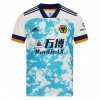
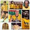
Everyone has their own take on what shade of gold we should wear so I'm going to go against the general feel of this thread so far and say for me it is too light. Maybe it's because I started supporting in the 80s but I think it should be slightly darker - ideally the shade of the Nutmeg shirts in the 90s.
I would like it slightly darker too. A shade too yellow for me. Still good though.
 

MotorWoden

Just doesn't shut up
Joined
Aug 28, 2006
Messages
3,086
Reaction score
2,938
I have always been so glad that the club colours are not run of the mill red or blue. We have our own very specific identity and I like the current version of our strip and the version in the first season after we go promoted.
 

Preston Wolf

Groupie
Joined
Apr 16, 2016
Messages
151
Reaction score
205
Everyone has their own take on what shade of gold we should wear so I'm going to go against the general feel of this thread so far and say for me it is too light. Maybe it's because I started supporting in the 80s but I think it should be slightly darker - ideally the shade of the Nutmeg shirts in the 90s.
The second Nutmeg shirt is an absolute classic, the quality is superb. Mine is still almost mint 25+ years on and I’ve been wearing it for fishing for the last 15!
 

Bacon Sandwich

Has a lot to say
Joined
Dec 30, 2020
Messages
1,942
Reaction score
7,299
One of the things I have always loved about Wolves is the kit. @MotorWoden has it spot on above - who the hell wants to support a team that plays in red or blue? And so many of the kits this year (see Man United yesterday) are just 'leisurewear.'

Can you seriously imagine supporting Man United and seeing slabhead slouching off the pitch wearing what looks like a **** pyjama top his auntie gave him?
 

Hot Fuss

Just doesn't shut up
Joined
Aug 27, 2019
Messages
5,747
Reaction score
14,103
One of the things I have always loved about Wolves is the kit. @MotorWoden has it spot on above - who the hell wants to support a team that plays in red or blue? And so many of the kits this year (see Man United yesterday) are just 'leisurewear.'

Can you seriously imagine supporting Man United and seeing slabhead slouching off the pitch wearing what looks like a **** pyjama top his auntie gave him?
2848F08E-5502-49AA-9321-33671A858119.jpeg
 

Glow69

Just doesn't shut up
Joined
Jul 28, 2016
Messages
3,538
Reaction score
7,054
Love this seasons collection. Best for years
 

Tonesterwolf

Senior Member
Joined
Sep 5, 2018
Messages
557
Reaction score
507
Too yellow for me.

Nutmeg got the colour spot on.
The first Nutmeg shirt was actually the seasons before in house "Molineux" shirt rebranded. So you could say the club got the colour spot in before ruining it all by signing with Puma for that wolf head shirt.
 

Newbridge Wolf

Just doesn't shut up
Joined
Aug 11, 2016
Messages
7,622
Reaction score
12,721
Thought it looked good on MOTD this morning, but in person it does look too yellow for me. Can’t even say it’s grown on me, every time I see it, I still instantly think Cambridge United.
 

Hot Fuss

Just doesn't shut up
Joined
Aug 27, 2019
Messages
5,747
Reaction score
14,103
The first Nutmeg shirt was actually the seasons before in house "Molineux" shirt rebranded. So you could say the club got the colour spot in before ruining it all by signing with Puma for that wolf head shirt.
Yes true.
 

Warrington_Wolf

Senior Member
Joined
Nov 23, 2014
Messages
742
Reaction score
1,888
The Nutmeg kits will never be topped for me.

Black collar, the crest, Goodyear. The away kit using the exact same template as the home.
 

Poztin

Just doesn't shut up
Joined
Jul 10, 2005
Messages
3,824
Reaction score
2,338
Everyone’s idea of old gold seems to align with the generation they grew up in. Weird that!

If you actually look at our history and take a trip to the club museum, historically the lighter shade has dominated our kits over the longest periods. Especially in the early years. The recent colours are closer to our roots than anything in recent history.


chignalwolf

Has a lot to say
Joined
Aug 8, 2017
Messages
1,842
Reaction score
3,022
Everyone has their own take on what shade of gold we should wear so I'm going to go against the general feel of this thread so far and say for me it is too light. Maybe it's because I started supporting in the 80s but I think it should be slightly darker - ideally the shade of the Nutmeg shirts in the 90s.
agree, we seemed to move away from the famous old gold, went to orange, then a yellow (Watford), but now getting back to old gold, but as you say it still needs to be darker, glad to see the all white away kit back,

the worst kit was when we had the yellow/gold shorts as well, looked terrible to me anyway
 
Last edited:

Stratman Wolves

Just doesn't shut up
Joined
Jan 24, 2011
Messages
4,070
Reaction score
3,730
The first Nutmeg shirt was actually the seasons before in house "Molineux" shirt rebranded. So you could say the club got the colour spot in before ruining it all by signing with Puma for that wolf head shirt.
Even the gold that Puma shirts had the following season was a good gold though. After that the **** gold colors came in and we were orange by time we went to Cardiff.
 

Kebab Warrior

Just doesn't shut up
Joined
Aug 26, 2019
Messages
4,706
Reaction score
12,234
Everyone has their own take on what shade of gold we should wear so I'm going to go against the general feel of this thread so far and say for me it is too light. Maybe it's because I started supporting in the 80s but I think it should be slightly darker - ideally the shade of the Nutmeg shirts in the 90s.
Booo this man.
 

Tonesterwolf

Senior Member
Joined
Sep 5, 2018
Messages
557
Reaction score
507
agree, we seemed to move away from the famous old gold, went to orange, then a yellow (Watford), but now getting back to old gold, but as you say it still needs to be darker, glad to see the all white away kit back,

the worst kit was when we had the yellow/gold shorts as well, looked terrible to me anyway
Agree about the gold shorts, I don't like them and I am pleased we don't seem to wear them anymore when there is a dark colour short clash with the opposition.
 
Back
Top Bottom