Redrockwanderer
Senior Member
- Joined
- Jul 10, 2019
- Messages
- 510
- Reaction score
- 959

I seem to remember they only went upto 2XL that year and XL the year after then back to 2XL, I may be wrongThey didn't after the first year with adidas
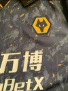
Found it on Twitter… looks like FIFA, could just be someone making them up on a software platform? Not sure…What's this from?
What's this from?
It's an age thing, we did go very orange at one point in the 80s and 90s. This year's shirt is spot on 60s and 70s colour for me.What’s with all the yellow? Check out these beauties from my loft. I don’t care what the official Patone is, these are the colours I want Wolves gear in.View attachment 22880
It’s a FIFA concept creator, posted on Twitter stating this is the case but they’re nearly spot onWhat's this from?
Hope not. Its horrible.
I have the W88 home in 3xl - bought last years 3rd kit in 2xl, very similar fit but a little tighter on the armsI seem to remember they only went upto 2XL that year and XL the year after then back to 2XL, I may be wrong
If the bits on the shoulders are the same as the home kit colour this is a winner for me
True, I guess the shade you grew up with as a kid is the one you associate most with Wolves. That 82-87 Umbro kit is the definitive one for me despite most of those years being an utterly horrendous time to support Wolves.It's an age thing, we did go very orange at one point in the 80s and 90s. This year's shirt is spot on 60s and 70s colour for me.
As you suggested, it looks better than the prototype used to catch the leaker.It’s a FIFA concept creator, posted on Twitter stating this is the case but they’re nearly spot on
The latest one on Twitter is the finished article, the one prior when all three cropped up is notAs you suggested, it looks better than the prototype used to catch the leaker.
Seeing it like that as against the Twitter close up. If it’s that I won’t be buying it. The white one may get my attention though.
Both kits are glorious in my opinion and way way better than the Adidas black and gold pinstripe and the white W88, if you liked those you’ll love these I assure yaSeeing it like that as against the Twitter close up. If it’s that I won’t be buying it. The white one may get my attention though.
Yup, it’s some Brazilian fella having a mess aroundThis is a concept for eFootball (formally Pro Evolution Soccer), from looking at it
Exactly. That orange screams Hull City to meTrue, I guess the shade you grew up with as a kid is the one you associate most with Wolves. That 82-87 Umbro kit is the definitive one for me despite most of those years being an utterly horrendous time to support Wolves.
") The 80s were horrible, thankfully I had memories of the 70s to tide me over. My older family members thought the 70s crap as they had experienced the 50s.
The 80s were horrible, thankfully I had memories of the 70s to tide me over. My older family members thought the 70s crap as they had experienced the 50s.I thought Adidas wolves shirts didn’t come in 3XL?
That’s good to hear as I think this years home shirt is the best since the W88 shirt and that white one was a particular favourite of mine. It’s the last time I bought both home and away shirts.Both kits are glorious in my opinion and way way better than the Adidas black and gold pinstripe and the white W88, if you liked those you’ll love these I assure ya
If you’re over 30 you may need to run…The latest looks like something from Star Trek !!

Assuming this isn't a windup, that's pretty nice and I could even live with the shoulder thingies. The collar and sleeve-end black/gold piping is very effective. Best of all, the white background colour even hides a little of the sponsor-logo's hideousness! Fingers crossed
And I even like this... it's another "leisure market" shirt that's been in vogue over the last couple of years but I think it's very effective.
The logo does look less offensive on a white background.Assuming this isn't a windup, that's pretty nice and I could even live with the shoulder thingies. The collar and sleeve-end black/gold piping is very effective. Best of all, the white background colour even hides a little of the sponsor-logo's hideousness! Fingers crossed
And I even like this... it's another "leisure market" shirt that's been in vogue over the last couple of years but I think it's very effective.
...
... assuming they're pucker, as I say.
Always out of stock when I looked - jammy sodI had 3xl in home shirt and in training tops every yr under Adidas
apart from the railway children was there a film in which jenny didn`t strip off?

Yes, exactly that... the McD/Chip thing just pops too much on the gold shirtThe logo does look less offensive on a white background.
The McDonalds logo poker chip also doesn’t look too bad when the rest of the lettering is white (like on the green ‘Mexico’ kit), it’s just on the gold shirt when the rest of the sponsor is in black that it particularly stands out.
Seeing it like that as against the Twitter close up. If it’s that I won’t be buying it. The white one may get my attention though.
It would be better if black like the text, but it’s their logo so they’d have to agree to that like W88 did.I wasn't keen on that other close up pic Nige,and I'm not keen on this one.But the more I look at it I reckon it would look nice in the flesh so to speak.
That is easily up there with some of the worst Wolves shirts ever.
The colour scheme of that shirt makes me think of a certain Sam Sparro song that used to be played regularly at Molineux...Newcastle's away kit just been released. Can't be long till ours now surely
Yuk! Not as bad as last season's second strip but....
That's orange! We aren't bloody Blackpool!What’s with all the yellow? Check out these beauties from my loft. I don’t care what the official Patone is, these are the colours I want Wolves gear in.View attachment 22880
Think I may wait for the white one Steve mate.I wasn't keen on that other close up pic Nige,and I'm not keen on this one.But the more I look at it I reckon it would look nice in the flesh so to speak.
Think I may wait for the white one Steve mate.