Welcome Notice

Hello and welcome to Molineux Mix a forum for Wolves fans by Wolves fans.

Register Log in

2023/ 2024 Kit

Balti Pie

Senior Member
Joined
Jul 3, 2005
Messages
545
Reaction score
261
It's definitely not as bad as some people are saying, but it's distinctly average at best. Looks like a training shirt. I'm guessing a big chunk of the objections are the colour. If that was Black with the pattern, I expect there would be more positivity. Might sell well with the youngsters, which might be the market they are going for.

The one thing that is annoying is I could design an infinitely better shirt in 5 minutes. The first Adidas shirts were fantastic. The 94/95 Nutmeg shirt was almost perfection.

I've wrote all that and I don't really care about football shirts. I'm nearly 50.
 

Sedgers

Has a lot to say
Joined
Mar 3, 2008
Messages
1,279
Reaction score
1,800
But It is packed with meaning. As soon as I saw it I thought it reminded me of the geometric architecture and tile patterns found around the Iberian Peninsula. Honest.

“The new red away strip will provide Wolves’ southern European players with a taste of home as they head on their travels this season thanks to the bespoke Castore design.

Inspired by the geometric architecture and tile patterns found around the Iberian Peninsula.”
Maybe when Jeff was talking about local inspiration he said Brierley Hill/Pensnett and something got lost in translation?
 
Last edited:

citrus_wolf

Senior Member
Joined
Dec 22, 2016
Messages
800
Reaction score
1,276
Wolves in red :( That 'Portugal' kit was at least a classy shade, this is cherry/lipstick bright.

It feels so off. I know away kits are experimental but this is Hall of Shame for me, sorry. Looks like training wear, and so far away from our identity.
 

Alex Rae The Substitute

Just doesn't shut up
Joined
May 14, 2012
Messages
7,492
Reaction score
9,210
Can only assume (hope) that the leaked home shirt that is doing the rounds being well received has caught the clubs attention and they’ve thought “best get this horrible ******* out first” then save the day with a more popular home kit.

But then, nothing surprises me with this club sometimes!

Nod to our Iberian/ Mediterranean players - what a load of *******s.
 

citrus_wolf

Senior Member
Joined
Dec 22, 2016
Messages
800
Reaction score
1,276
Chinese influence. Red being the colour of Happiness, success and good fortune.

This is a really good interpretation, Chinese New Year and auspicious vibes.

It's too 'The Reds' for my taste :neutral:
 

Adrian_Monk

Just doesn't shut up
Joined
Apr 17, 2006
Messages
16,547
Reaction score
13,427
Not quite as partisan as some of the responses, but not very keen at all. Red and green should never be seen (apart from Christmas)

Don't see what is vaguely Iberian about the random geometric shapes - at least the kebab sauce splodges won't show quite as much.

Only chance of me buying this is if the Chinese get the colour wrong and both the red and green are substantially darker!
 

Bill S Preston Esq.

Just doesn't shut up
Joined
Feb 27, 2016
Messages
11,302
Reaction score
18,238
Not quite as partisan as some of the responses, but not very keen at all. Red and green should never be seen (apart from Christmas)

Don't see what is vaguely Iberian about the random geometric shapes - at least the kebab sauce splodges won't show quite as much.

Only chance of me buying this is if the Chinese get the colour wrong and both the red and green are substantially darker!
Ooh kebab sauce, announce Gundogan!!!
 

sillytuna

Just doesn't shut up
Joined
Jul 12, 2016
Messages
5,074
Reaction score
9,301
Well I'm the only one pleased because I play in red or blue in 6-a-side and now I get to have a Wolves red shirt to go with my Peru and Flamengo tops :cool:
 

Wandsworth Wolf

Senior Member
Joined
Jul 15, 2011
Messages
826
Reaction score
1,430
Not quite as partisan as some of the responses, but not very keen at all. Red and green should never be seen (apart from Christmas)

Don't see what is vaguely Iberian about the random geometric shapes - at least the kebab sauce splodges won't show quite as much.

Only chance of me buying this is if the Chinese get the colour wrong and both the red and green are substantially darker!

All that stuff about Iberian tile patterns is nonsense - it's just post-rationalisation to try and make it meaningful.
Just like like the geometric pattern on last year's away shirt, supposedly inspired by the architecture of Molineux.
Yeah right.
Don't fall for it.
These random patterns are just knocked-out by the manufacturer's design team.
Maybe each club gets to choose from a selection.
Then, as part of the launch marketing push, each club will invent some sort of lame back-story (or narrative, as we call it in the ad industry) to make it relevant.
 

Agent Cooper

Senior Member
Joined
Jul 23, 2018
Messages
906
Reaction score
1,599
Dow know what yam all moaning about.None of ya wear em anyway.Yam all over 35.
Yep. Not worn replica shirts since my 20's, so not fussed but I don't sneer at people who do. Their choice. Can't see this being as popular with legacy fans as some previous away kits, so as I said they must be targeting overseas fans in Portugal, Spain, China, South Korea, US etc where red is a popular colour and should do well. In the modern money driven game if it's a financial success then that's all that matters I suppose. Every little helps!
 

citrus_wolf

Senior Member
Joined
Dec 22, 2016
Messages
800
Reaction score
1,276
All that stuff about Iberian tile patterns is nonsense - it's just post-rationalisation to try and make it meaningful.
Just like like the geometric pattern on last year's away shirt, supposedly inspired by the architecture of Molineux.
Yeah right.
Don't fall for it.
These random patterns are just knocked-out by the manufacturer's design team.
Maybe each club gets to choose from a selection.
Then, as part of the launch marketing push, each club will invent some sort of lame back-story (or narrative, as we call it in the ad industry) to make it relevant.
I thought they were 'Wolves eyes'! I'm amazed at that tile nonsense they come out with, I thought the 'geometric shapes' were just Wolf eye triangles. Too basic for PR speak I guess:D
 

SmokeyGB

Just doesn't shut up
Joined
Jul 7, 2006
Messages
5,971
Reaction score
2,942
Give it 6 month you can have it for £20 with free delivery, then another month after 10% off the £20 due to the large amount of stock we have of the Red Kit!......Yep RED kit.
I'll say it again, Wolves and a red kit, guess from a distance it could look like a cheap Man Utd knock off.
 

Ian

Just doesn't shut up
Joined
Nov 25, 2007
Messages
2,130
Reaction score
2,881
Don't really like the away kit, even though it would be a great shirt to wear to a Wales match!

View attachment 35306

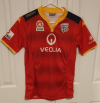
Hmmmm at least i'll be able to wear it to watch my local team play s-l500.png

Adelaide United!

As others have said, I'm surprised its taken so long for us to get a red 2nd strip, I thought it was inevitable with Chinese owners.
 

moseleyite

Just doesn't shut up
Joined
Aug 13, 2012
Messages
5,119
Reaction score
4,362
On the one hand, I've not worn any Wolves gear since I hit my 30's, 20 years ago so I shouldn't be that bothered.

On the other hand... this red monster is (to my eye) too horrible for words! Colour, panels, piping, pattern... it's like somebody deliberately tried to trigger me in terms of strip design! :D
 

Kingswood Wolf

Has a lot to say
Joined
Nov 12, 2010
Messages
1,891
Reaction score
2,366
Wolves team's original colours upon formation were red and white, adopted from the school colours of St Lukes, for much of their history their home colours have been their distinctive old gold shirts with black shorts.
Yeah but cholera and polio were a thing back then too and I don't want them coming back in 2023 ffs
 

Wall heath Wanderer

Just doesn't shut up
Joined
Jan 1, 2013
Messages
6,707
Reaction score
6,493
I never thought that any strip would make me look upon that white and blue cloud monstrosity favorably.

On a plus side, next time I am told to put my safety glasses on at work as I will regret losing my eyesight in an accident I can just show the boss a picture of this shirt and say "wanna bet?".
 

moseleyite

Just doesn't shut up
Joined
Aug 13, 2012
Messages
5,119
Reaction score
4,362
Genuinely don't understand what's so bad about it.

So it's red, why is that an issue other than it's not black or white?

Fair question. For me, it's not that it's just red and, in fact, I actually really liked the "Portugal-red" away strip because it felt well put together and thought out and ... harmonious is the best word I can think of - the green and red in that strip worked so well together. Classy.

This, on the other hand, uses bright, fire-engine red which just jars my senses, especially when it clashes nastily with the gold/orange piping/badge/logo and what looks like greenish panelling. The way the red in the sleeve-sponsor logo on last season's home strip felt jarring is the same but in reverse if that makes sense.

But, I accept it's totally subjective and other people might scream Take my money; this is just my take and, to me, it feels mixed-up, fugly and colour-clashing. Also, as I said, I haven't bought a scrap of merch in 20 years so it's not going to impact me directly. But, if asked for an opinion, I think it's terrible.

EDIT: "Jars my senses" is perhaps a tiny bit drama-queeny reading it back :D
 

S G Wolves

Bad lover
Joined
Feb 4, 2018
Messages
7,631
Reaction score
12,376
Its OK, not bad...

But can't wear red, just feels wrong.

I've only ever bought Wolves gold home tops anyway.
 

wallace

Just doesn't shut up
Joined
Apr 1, 2006
Messages
5,559
Reaction score
1,755
It doesnt shout wolves does it, more a fashion shirt with a wolves badge on.
 

Dubwolf71

Just doesn't shut up
Joined
Apr 3, 2009
Messages
5,813
Reaction score
3,261
Will blend in well on our away fans at Old Trafford for our first game of the season.
 

JimB

Groupie
Joined
Jan 18, 2019
Messages
172
Reaction score
169
The last second kit I got was the green Europa league one, looking at that red one, it will still be the latest one I’ve got. Not for me - awful.
 

Superted

Has a lot to say
Joined
Jul 21, 2016
Messages
1,959
Reaction score
3,563
Fair question. For me, it's not that it's just red and, in fact, I actually really liked the "Portugal-red" away strip because it felt well put together and thought out and ... harmonious is the best word I can think of - the green and red in that strip worked so well together. Classy.

This, on the other hand, uses bright, fire-engine red which just jars my senses, especially when it clashes nastily with the gold/orange piping/badge/logo and what looks like greenish panelling. The way the red in the sleeve-sponsor logo on last season's home strip felt jarring is the same but in reverse if that makes sense.

But, I accept it's totally subjective and other people might scream Take my money; this is just my take and, to me, it feels mixed-up, fugly and colour-clashing. Also, as I said, I haven't bought a scrap of merch in 20 years so it's not going to impact me directly. But, if asked for an opinion, I think it's terrible.

EDIT: "Jars my senses" is perhaps a tiny bit drama-queeny reading it back :D
I get it's all subjective but I'm just surprised by the strength and depth of the general dislike. Like I said earlier, it ain't a classic by any means but I can't see anything in it that I'd have thought could be described as "awful" or "hideous".

I wouldn't have put those two colours together myself, and I probably wouldn't have gone for a red kit either, mainly because I'm not sure there are many colours that compliment red that would be acceptable to us as fans. If you use black or white then people would rightly complain that it looks like Man U. Maybe Yellow/gold, then you'll be looking like Watford's away shirt.
 
Back
Top Bottom